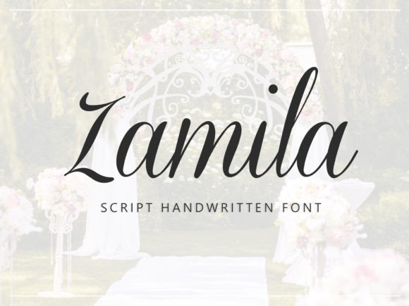
Zamila Font: Elegant Script for Digital Branding
As a UI designer who builds landing pages, SaaS dashboards, and boutique e-commerce sites, I reach for Zamila when I need typography that communicates refinement without sacrificing clarity. Zamila isn’t just another script font—it’s a Script Amp typeface engineered for digital presence: delicate yet legible, expressive but controlled. Its letters trace smooth, calligraphic strokes with subtle contrast and graceful entry/exit terminals—each curve calibrated to guide the eye, not distract it.
Zamila excels where personality meets purpose: hero section headlines, product name treatments, testimonial quotes, and branded banners. On a coaching website’s hero banner, “Your Journey Starts Here” in Zamila—set large, centered, over a soft gradient—immediately signals warmth and intentionality. In an online jewelry store, it transforms product titles like “Luna Pendant” into tactile, memorable moments. Because Zamila is designed as a display font—not body text—it thrives in short-form, high-impact contexts where tone and recognition matter more than paragraph density.
Readability on screen is non-negotiable—and Zamila delivers when used intentionally. At 32px and above on desktop, its open counters and balanced spacing ensure clean rendering across Chrome, Safari, and Firefox. On mobile, I scale it to a minimum of 28px for headlines and avoid using it below 24px—even then, only in high-contrast light-on-dark or dark-on-light scenarios. It performs reliably over image overlays when paired with a subtle text shadow (1px black at 30% opacity) or a semi-transparent background bar. Avoid thin weights on low-DPI screens; stick to the Regular or Medium weight for consistent stroke integrity.
Visual Hierarchy & Conversion-Focused Layouts
In conversion-driven layouts—think course sales pages or newsletter opt-in sections—Zamila strengthens hierarchy by creating clear typographic “beacons.” A headline like “Join the Creative Circle” in Zamila draws attention before the supporting sans serif subhead (“A 6-week cohort for designers & founders”) even registers. That contrast—elegant script versus neutral body copy—creates rhythm and directs scanning behavior naturally. Users don’t read every word first; they follow visual weight. Zamila anchors the top of that flow.
It’s especially effective for CTAs that benefit from emotional resonance: “Begin Your Story”, “Claim Your Spot”, “Design With Intention”. When applied to button labels (at 18–20px, uppercase, letter-spacing 0.5px), Zamila adds distinction without compromising tap target size—just ensure padding remains generous (minimum 12px vertical, 24px horizontal) for touch accuracy.
Brand Identity & Consistent Digital Presence
Zamila supports cohesive brand identity across platforms—not just websites, but social media graphics, email headers, digital ad creatives, and downloadable brand kits. Used consistently in logo lockups (e.g., a studio name alongside a minimalist icon), it conveys craftsmanship and care. For a creative portfolio site, pairing Zamila with a crisp, humanist sans serif like Inter or Manrope creates balance: expressive headline + trustworthy interface text. That pairing reinforces professionalism while preserving voice.
For editorial or lifestyle brands, Zamila pairs beautifully with a warm serif like Lora or Playfair Display—adding texture without competing. The key is contrast: if Zamila brings fluidity, the secondary font should offer structure. Never pair it with another script or decorative display font; visual clutter dilutes impact.
Practical Implementation Notes
Zamila ships as a modern webfont package: WOFF2 files optimized for fast loading, full OpenType support (including ligatures and stylistic alternates), and multilingual coverage for Western European languages. It includes one primary weight with true italics—no algorithmic slanting—so typographic integrity holds across devices. No variable axis, but the single weight is precisely tuned for screen use: robust enough for small headings, refined enough for large displays.
When integrating into a design system, define clear usage rules: Zamila for H1s and branded section titles only; never for navigation, form labels, or data tables. Use it to mark moments of emphasis—not repetition. In Figma or Sketch, I save it as a text style named “Zamila / Hero Headline” with preset tracking and line-height to enforce consistency across team members and client handoffs.
Licensing is straightforward: Zamila is a commercial font, meaning it requires a valid license for any public-facing use—including client websites, Shopify themes, Notion templates, and SaaS dashboards. One license covers unlimited domains and projects under your direct control. If you’re building templates for resale or white-label platforms, confirm extended licensing terms with the foundry. Always self-host webfonts—don’t rely on third-party CDNs—to maintain performance and compliance.
Where Zamila Fits Best (and Where to Pause)
- Use for: Hero headlines, logo lockups, testimonial pull-quotes, email subject lines, social post headers, course title cards, packaging mockups, and digital ad banners.
- Limit to: Short phrases (under 6 words ideal), titles with clear semantic hierarchy, and contexts where brand voice leans toward thoughtful, artisanal, or elevated.
- Avoid for: Long paragraphs, navigation menus, form inputs, error messages, data-dense dashboards, or accessibility-critical UI elements like WCAG-compliant labels (pair instead with a tested accessible sans serif).
Ultimately, Zamila isn’t about ornamentation—it’s about intentionality. In a landscape saturated with generic fonts, choosing Zamila signals that your brand values craft, clarity, and connection. It doesn’t shout. It invites. And in digital experiences where first impressions shape trust in under three seconds, that quiet confidence is exactly what converts.